Rental Management System
Enhancing the experience in vehicle management systems.
Automating car rentals in the cloud.
RentlySoft is a SaaS company offering fleet management and vehicle rental software for rental companies worldwide. Its cloud-based system automates key tasks, improving productivity and facilitating daily operations.

More features, more challenges.
The expansion and changing nature of the business presented a unique set of UX obstacles.
Poor scalability.
The design and navigation were not optimized for a rapidly expanding application.
Flows misaligned with operational reality.
Frequent actions were inaccessible or required unnecessary steps, affecting efficiency.
Lack of structure and hierarchy in information.
Information lacked organization, making it difficult to identify priorities.
Create a clear and coherent experience in an environment with multiple user profiles, without losing the functional depth required by the business.
Design principles.
Clarity first.
Prioritize visual hierarchy and accessibility of relevant information.
Consistency in experience.
Define reusable patterns for seamless and predictable navigation.
Reduction of cognitive load.
Simplification of decisions and reduction of unnecessary elements.
User-centered design
Working with real people, testing and validation with users.
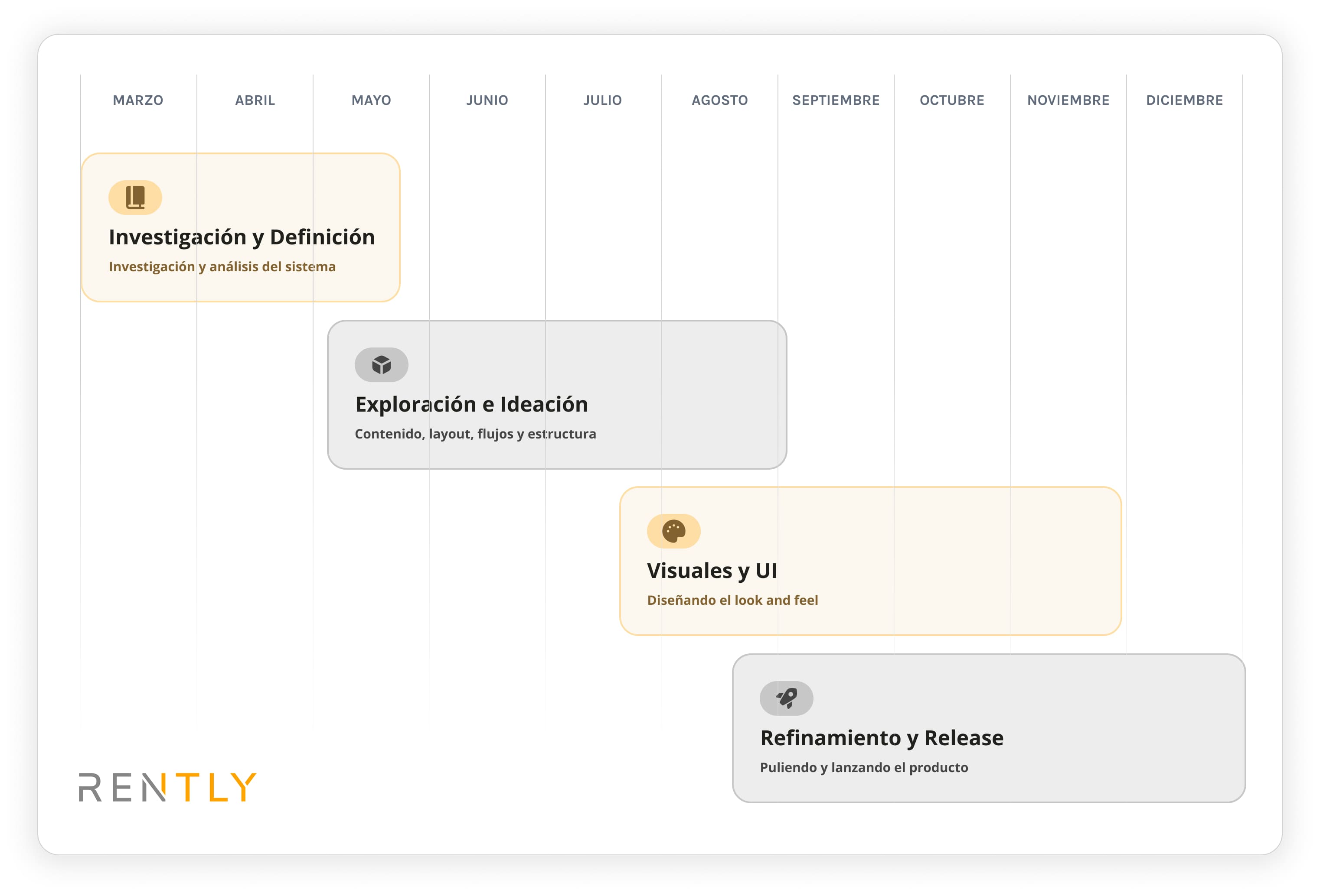
Design is strategy. Good planning is the foundation of success.
An obstacle for the business.
RentlySoft grew in features and clients, but the lack of a scalable structure affected the experience.
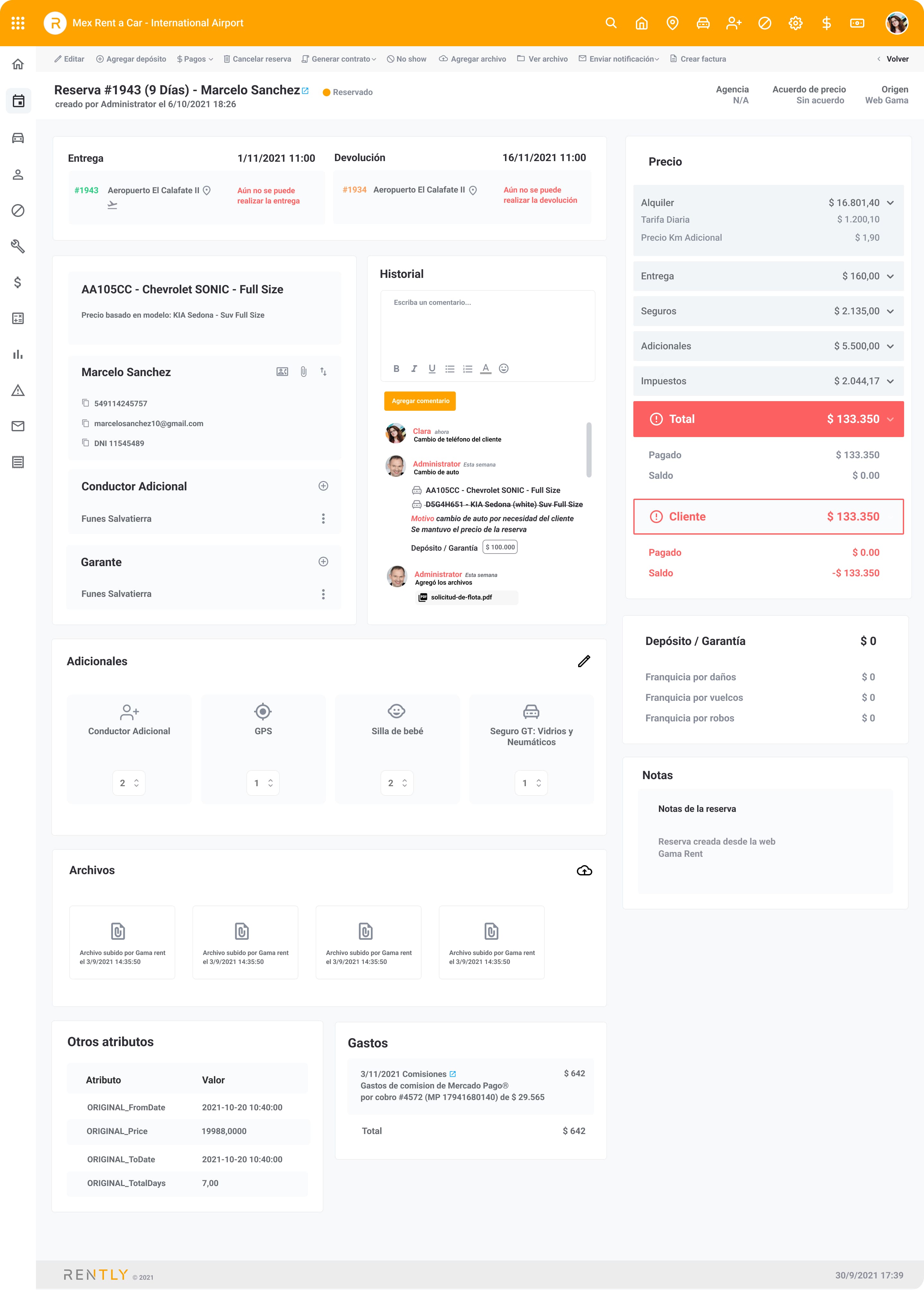
Reservation detail (Previous).
Challenges in the system.
The system not only made daily work difficult for users, but also impacted the overall operation of the business. We identified multiple friction points requiring urgent attention:
Lack of visual hierarchy and information structure.
Inconsistent controls and no reusable patterns.
Scarce system feedback.
Inaccessible interactions.
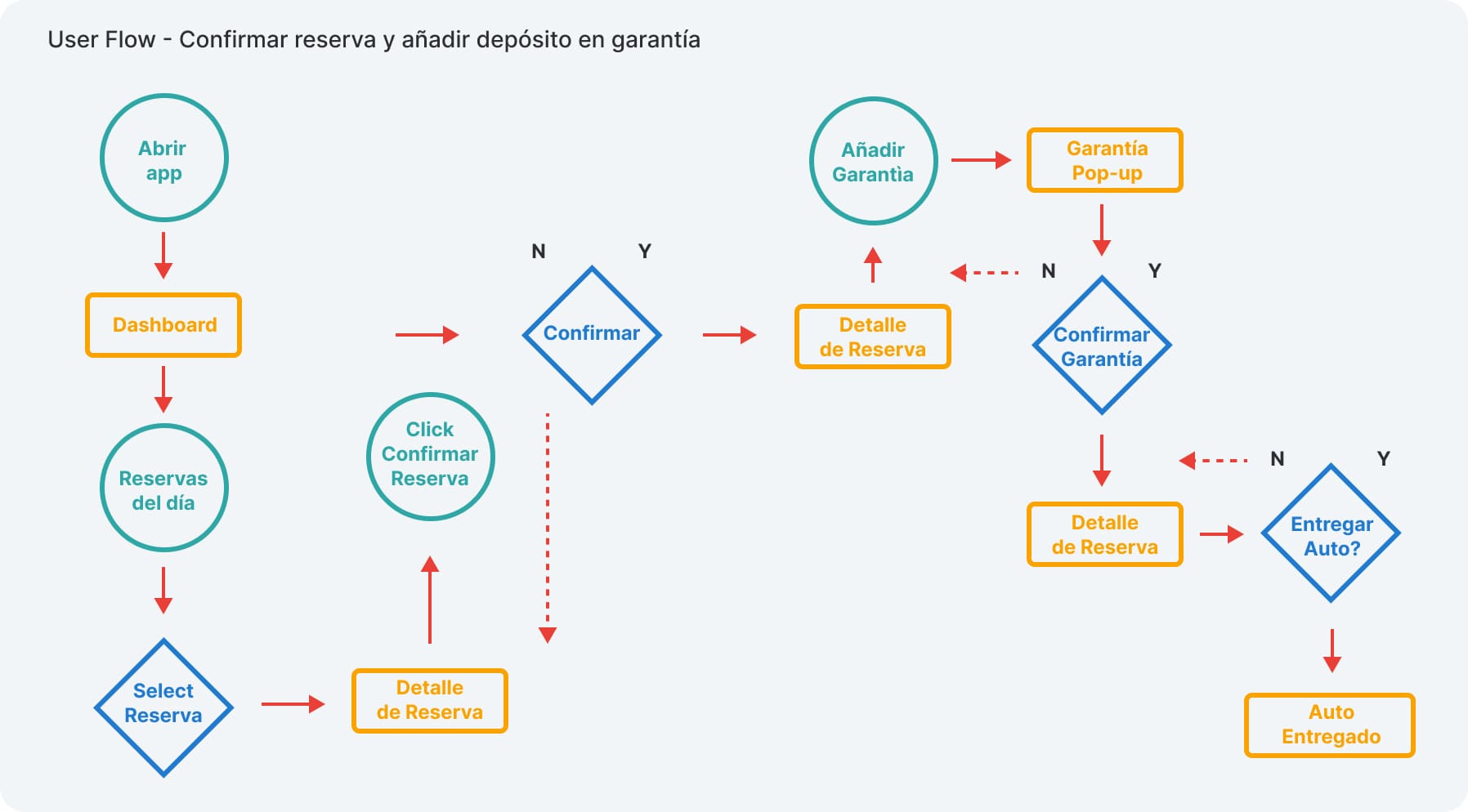
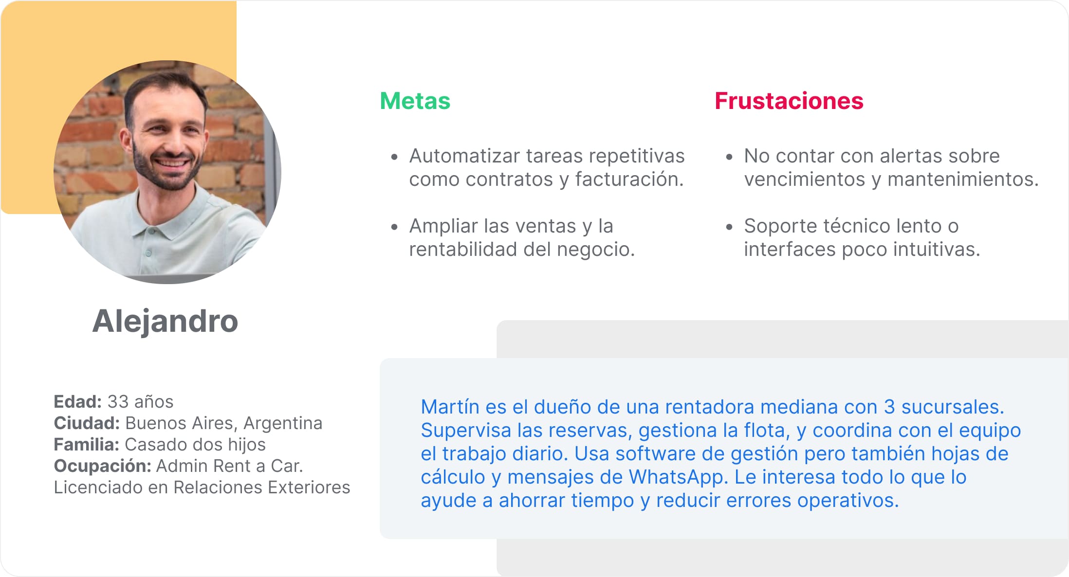
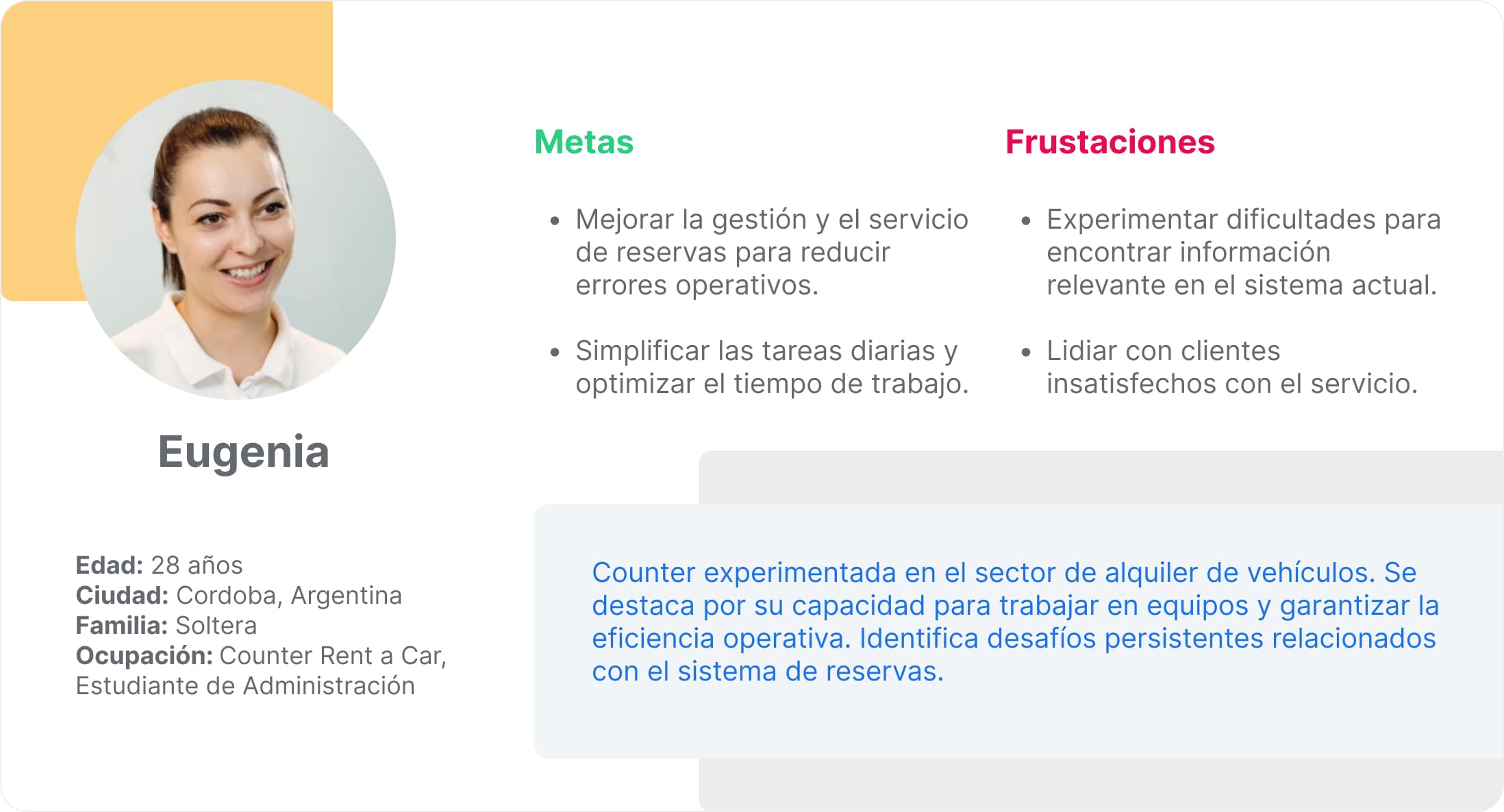
Personas and user flows allowed us to empathize with real system profiles and deeply understand their actions. This combination gave us a clear picture of who uses the platform and how they use it.
Redesigning from findings.
Based on system analysis, user interviews, and stakeholder discussions, we proposed solutions focused on clarity and scalability:
Reduced and simplified navigation, prioritizing the most relevant information.
Grouped content into logical and easy-to-explore tabs.
Standardized controls and improved visual styles, iconography, and micro-interactions.
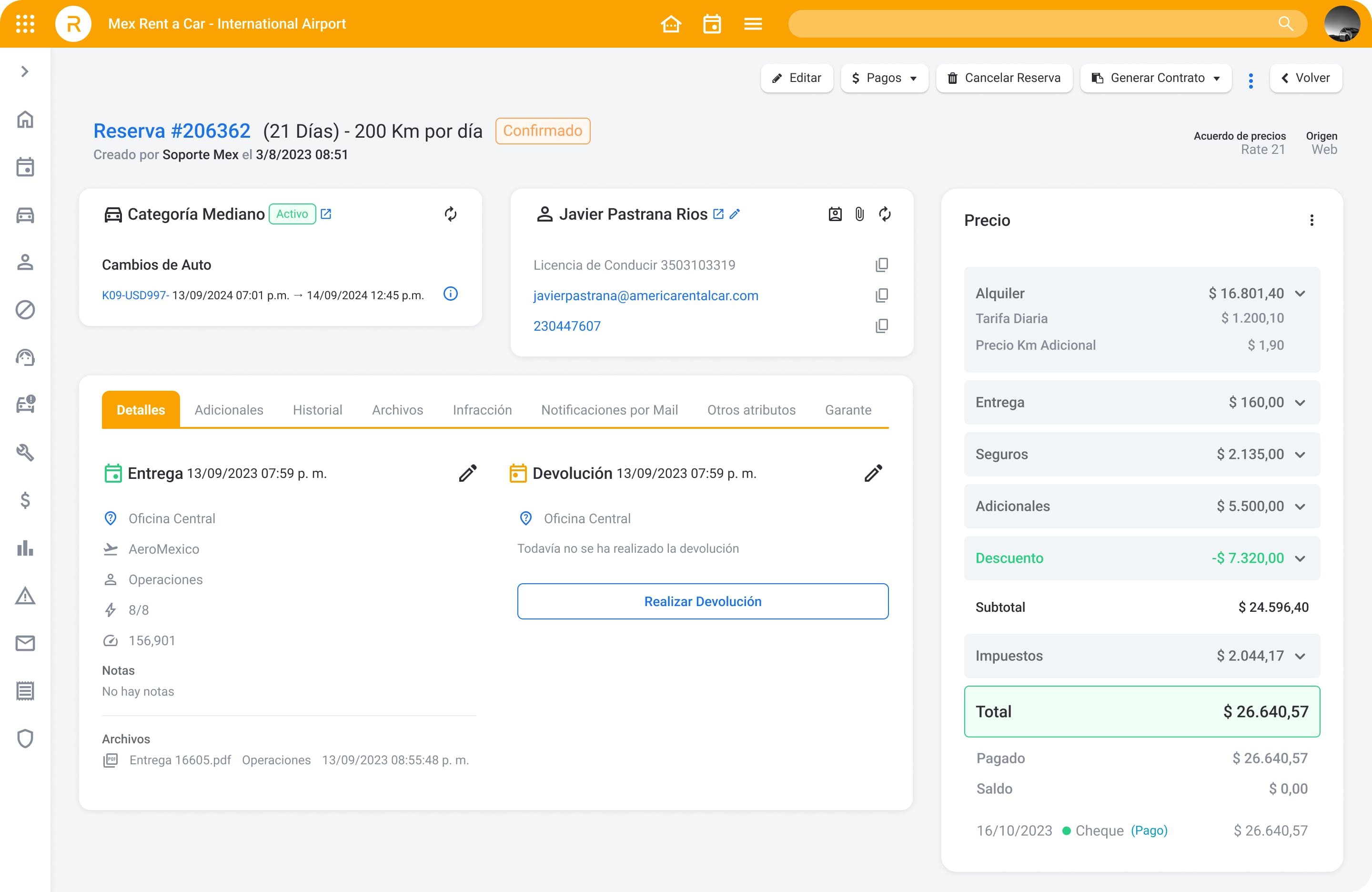
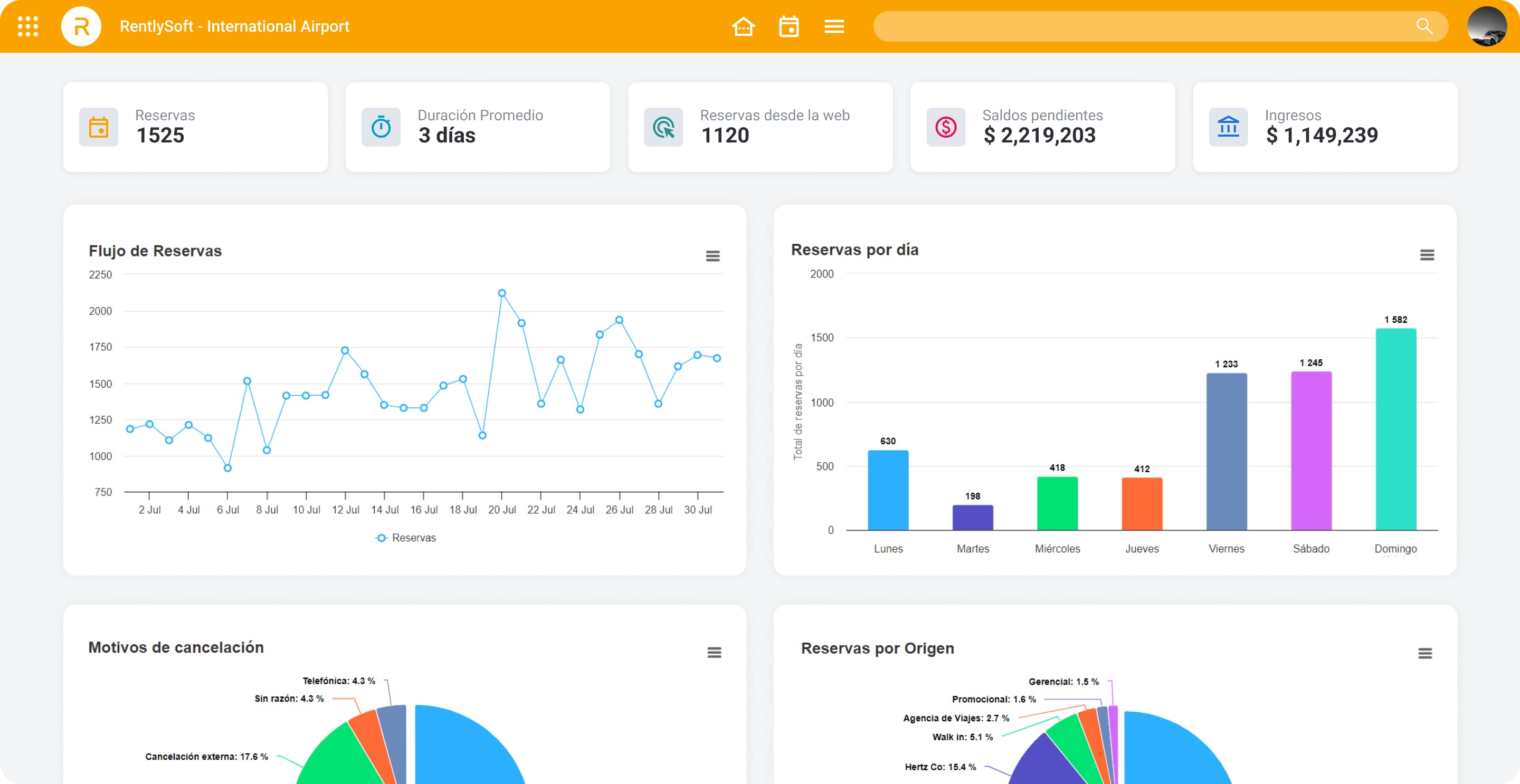
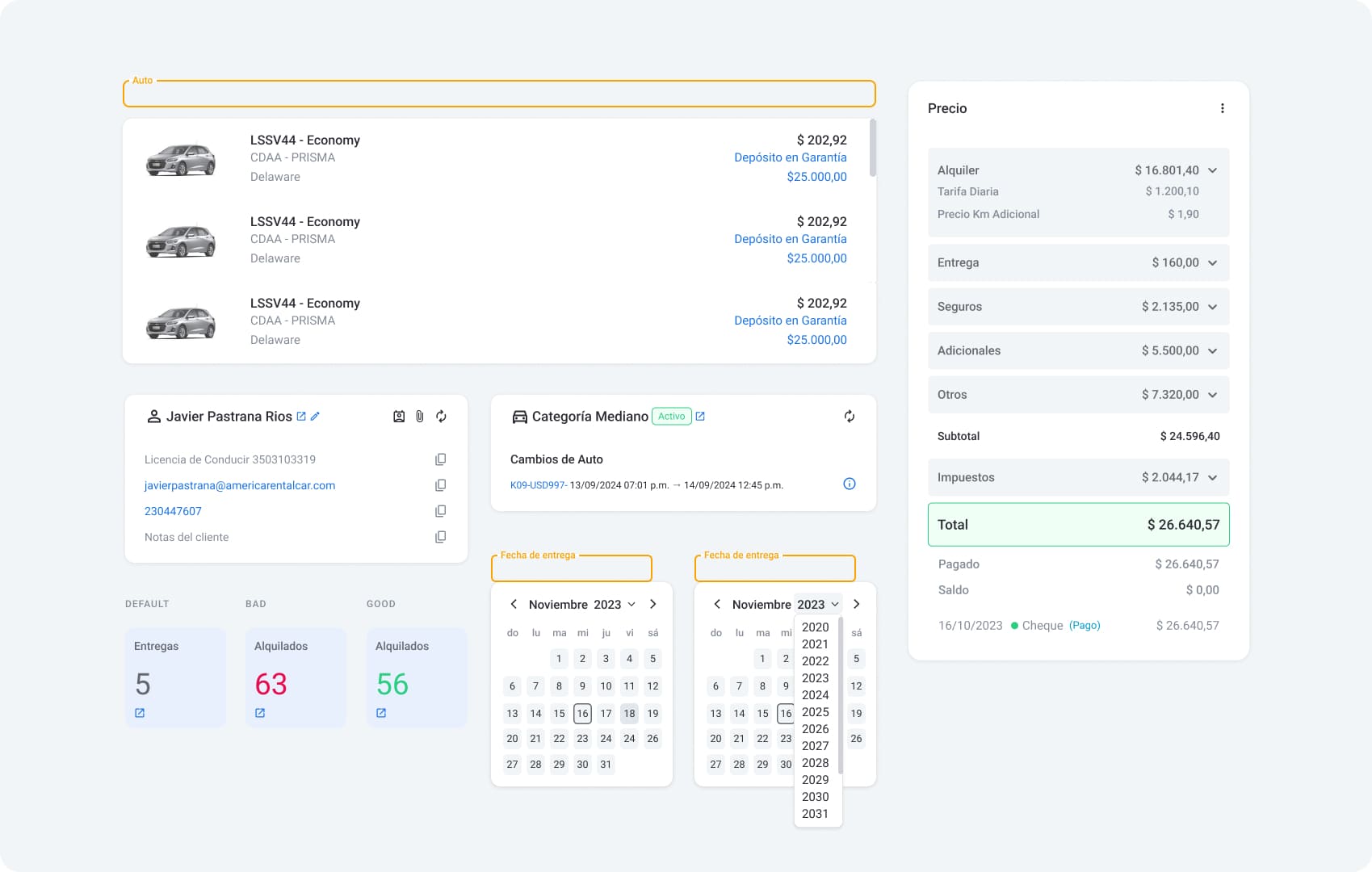
Reservation detail (New).
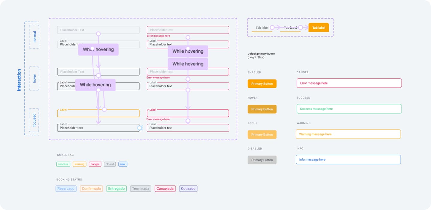
Design system. Interactions on inputs and tabs.
Reusable components allowed scaling the project with consistency.
Measuring impact.
Great Success
+43% satisfaction level (out of 105 surveyed).
+80% system usability scale (SUS).
+25% increase in sales.
SUS Score
Project lessons.
Talking to people is essential.
Conversations with users and stakeholders were key to understanding real needs and adjusting the design during the process.
Constant improvement is fundamental.
Work on a growing product doesn't end with a redesign. Continuous iteration and feedback allowed us to constantly polish details.
Scaling with coherence.
Creating a robust design system from the start facilitates product expansion without losing consistency or experience quality.
Final notes.
This project taught me the importance of constant iteration and adapting to changing business needs. The redesign improved the experience and collaboration between teams, and also allowed me to participate and contribute in all phases of the project, which was and is very enriching.