Dashboard - 360° View
Understanding each client from an integral and strategic perspective.
A transversal tool in the organization.
Grupo Sancor Seguros operates with multiple business units: ART Insurance, Health, Home, and Retirement, among others. The goal of the 360 View is not only operational, but also strategic: to consolidate scattered data in a single place to improve decision-making.
What is the 360° view?.
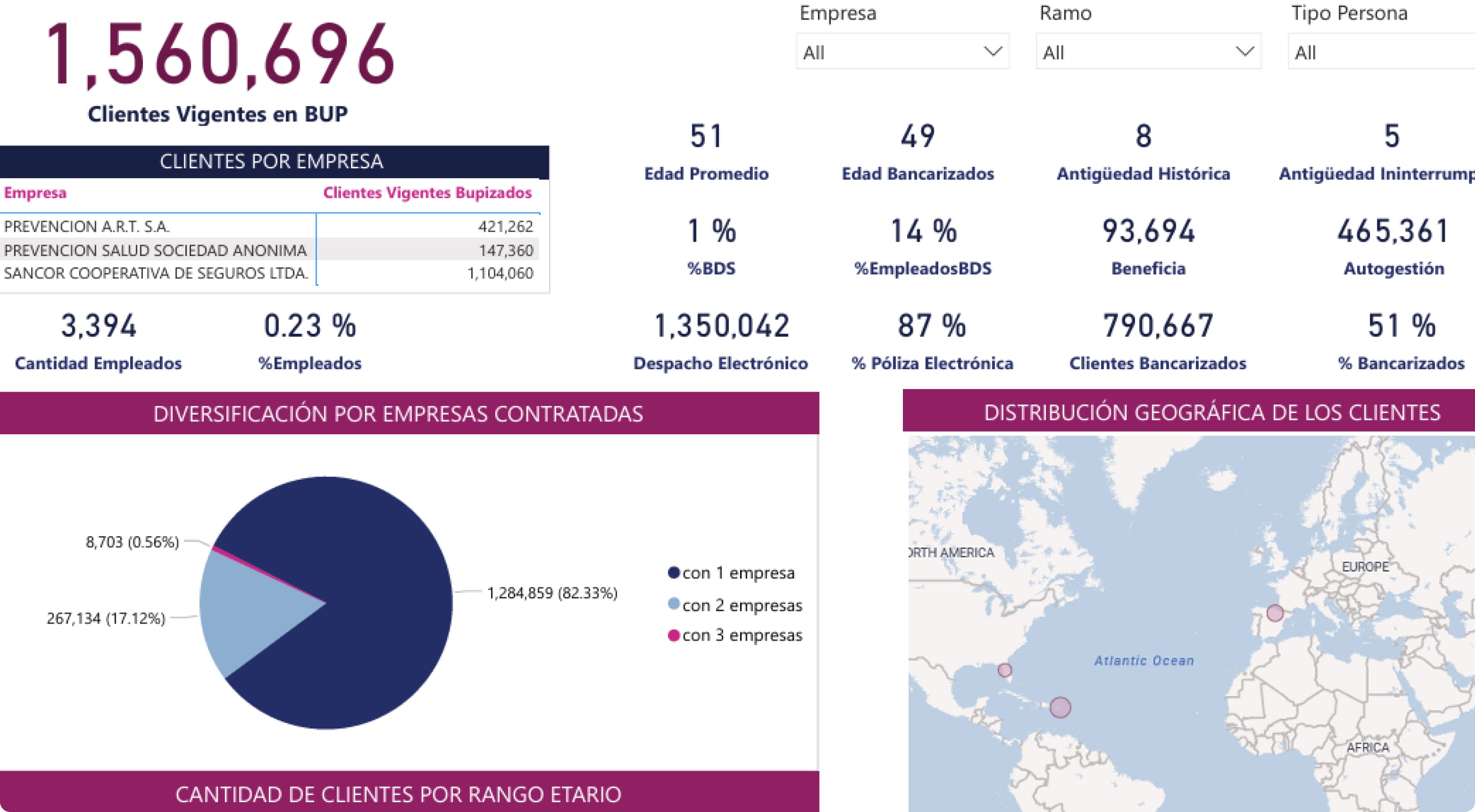
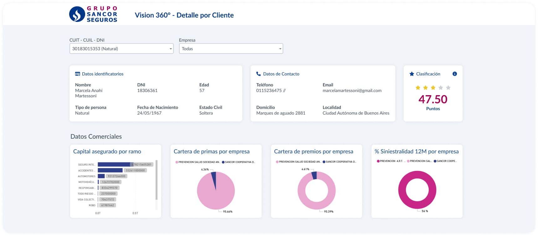
The 360° View unifies client interactions with the Group, integrating data from internal sources such as BUP (Single Person Base), policies, claims, and commercial dashboards.
Used by 500 users with key roles.
Commercial executives, business unit underwriters, service analysts, and technical referents.
Understanding the customer before an interaction.
Before contacting the customer, users need to have a clear and complete understanding of who that person or company is.
Assess the risk or the accident rate.
One of the great values for commercial profiles is being able to estimate the risk associated with a person or company.
Personalize proposals based on history.
Personalizing offers is key to increasing sales conversion.
Designing a robust, clear, and scalable tool for commercial profiles, in a corporate environment with great information density and multiple data sources.
Design principles.
Clear visual hierarchy.
Organize information into blocks and tabs with well-defined emphasis levels.
Inclusive and accessible design.
Ensure good contrast and readability, so that the 500 users can interact comfortably.
Structural scalability.
Thinking about the continuous growth of the tool so that it is not a limitation in the future.
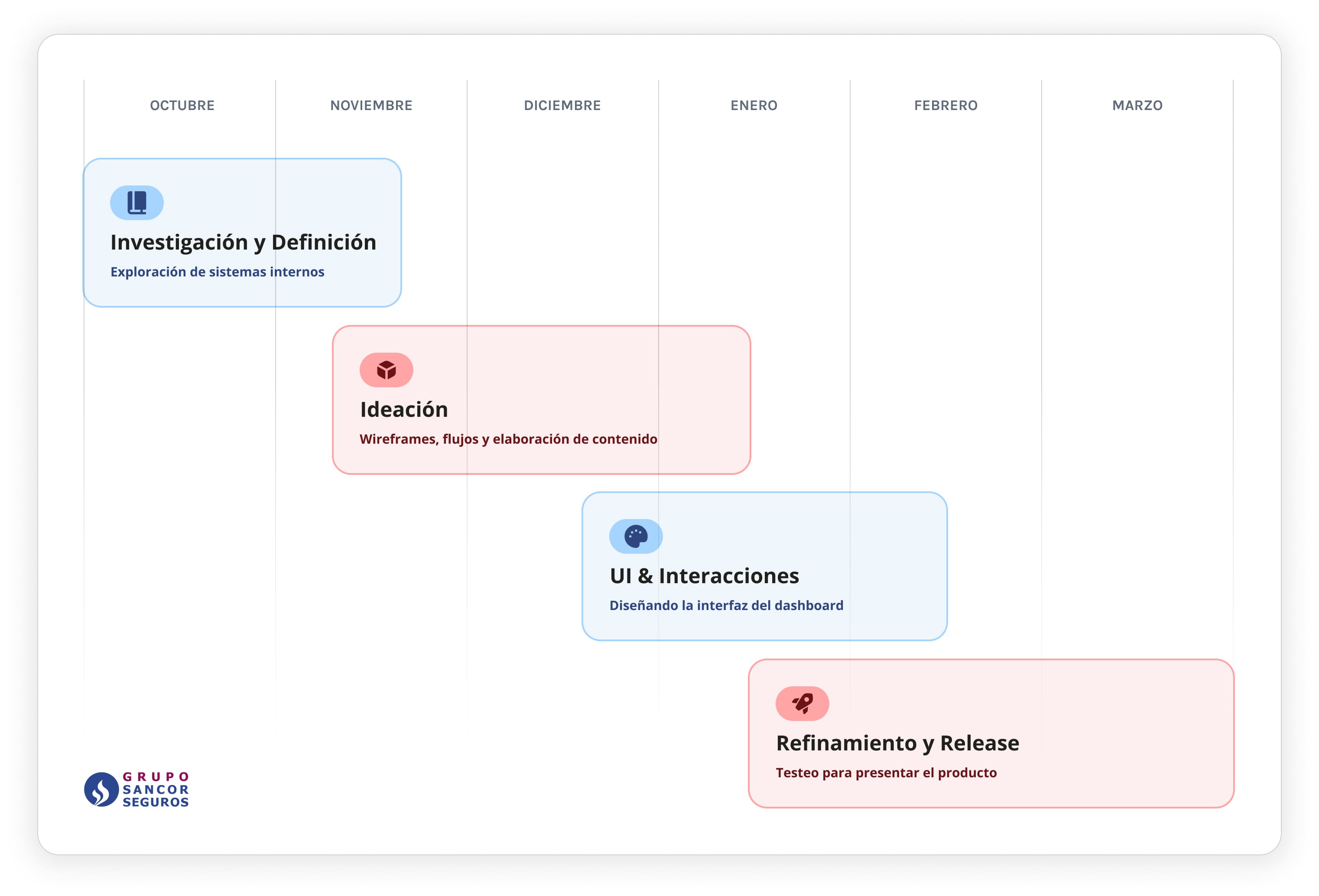
It was 6 months of great work together with multiple profiles, business, analysts, and developers.
Functional and technical audit.
We surveyed data sources, systems, and business rules. We created a master document with +50 key concepts to display or cross-reference in the view.
Research and interviews.
We worked together with commercial profiles to map key tasks, such as client search and reporting. We investigated the internal applications they used to track clients and then iterated with wireframes and prototypes. We detected the following pain points:
Lack of visual hierarchy and information structure.
Small click zones and poorly optimized spaces.
Scarce graphic visualization to read trends or assess situations.
Absent functional documentation, hindering product evolution.
Internal systems showed worrying signs
Implemented solutions.
We proposed solutions focused on clarity, accessibility, and scalability, standardizing design patterns to achieve intuitive navigation consistent with other group applications. This allowed reducing the learning curve and generating a more integrated experience within the company's digital solutions ecosystem.
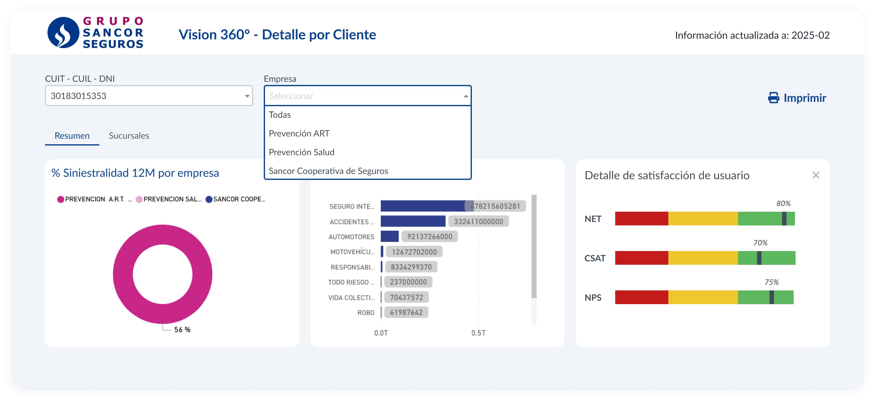
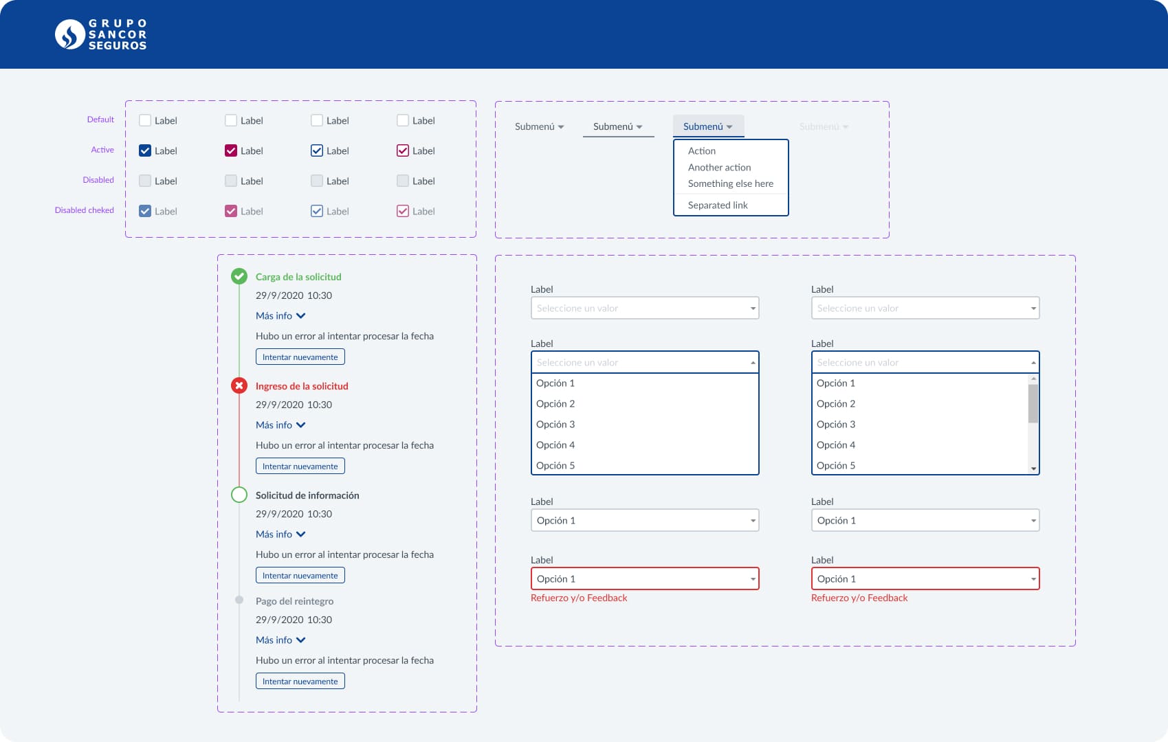
Design by information blocks, together with links to personalized commercial dashboards.
Smart filters and optimized search by CUIT, DNI, and multiple company selection.
Clear graphic visualization of key indicators with contact and satisfaction trends.
Functional documentation of each component to facilitate future evolution.
The importance of graphics and at-a-glance view.
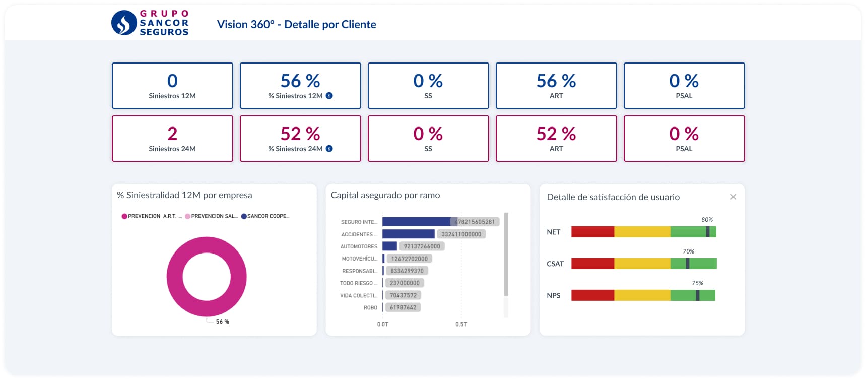
KPIs are essential metrics to measure performance and guide decision-making.
Maintenance and updating of components. Key work to ensure product evolution.
Grids and the group's design system were used to achieve a clear, scalable interface aligned with other apps.
Impact on users
Great News
+70% of users found it easier to complete critical tasks.
–42% in client information search and validation time.
+36% in tool adoption rate (vs. previous tools).
SUS: 82 (out of 100).
SUS Score
Key learnings.
Think big.
Designing for 500 users with different profiles requires special focus on shared tasks, accessibility, and clarity.
The value of the process.
Designing is not just generating screens, but building a living and sustainable structure.
Visualize ≠ show everything.
What is important is not just having the data, but prioritizing and presenting what the user needs at the right moment.
Final notes.
This case shows us how user experience design can be a strategic tool to unify the vision of the client within a complex organization. It was not just about an interface, but about aligning commercial, technical, and service areas around a single goal: knowing the client better to serve them better.